Redesigning light therapy for effortless treatments
Designed for those with little experience in light therapy.
Timeline: 5 months
Company: Applied BioPhotonics Ltd.
My Role: UI Designer, Researcher
Tools: Adobe XD, Figma, Adobe Illustrator
Problem Statement
Administering therapy
Applied BioPhotonics, Ltd. faced usability challenges with their Photobiomodulation Therapy (PBMT) System, a light therapy device used by hospitals, clinics, therapists, and consumers.
The existing Classic System had a steep learning curve, leading to difficulties for new users in effectively utilizing the device for various ailments. These challenges resulted in frustration, reduced user confidence, and suboptimal outcomes, limiting the device’s accessibility and market potential.
The Why. Light therapy has the potential to transform pain relief and rehabilitation, but its adoption is limited when users face uncertainty or complexity in operating therapeutic devices. Creating a seamless and user-friendly experience expands the system’s reach and enables users to fully benefit from the technology.
Before
After
Updated UI style guide
I established the overall feel of the proprietary interface to be more modern, accessible, and inclusive to better serve our international market.
Familiar but modern
A visual reskin of the existing UI with a few critical edits.
Accessible and inclusive
Dual language, greater contrast, and better representation.
More guidance
I pushed for space to be made for descriptors for each program.
Research-based
I conducted field research involving 29 patients. This involved observations, interviews, and contextual inquiries.
Clinical Usage. I shadowed two clinics for 3 days, where they treated an average of 8 clients daily.
Individual Usage. I observed 5 individuals treat themselves with the system.
I asked questions about: ➡ The set-up and treatment process ➡ Their knowledge of light therapy ➡ Their health goals and concerns ➡ Their treatment plan
Personas and journey maps created empathy and illustrated several pain points with using the system.
Our goal was to address the following pain points:
Complex Tx Selection
Users were unsure which treatments to use, how often to apply them, and in what order.
Frequent Interruptions
The system required users to manually set treatments every 20 minutes, disrupting the therapy session.
Difficulty in Self-Treatment
The system was challenging to operate when users were alone, especially for those who might fall asleep during sessions.
Mastery, simplified
Collaborating with the CEO and Chief Manufacturing Officer, I created a user flow and programs that allowed for effective treatment without domain mastery.
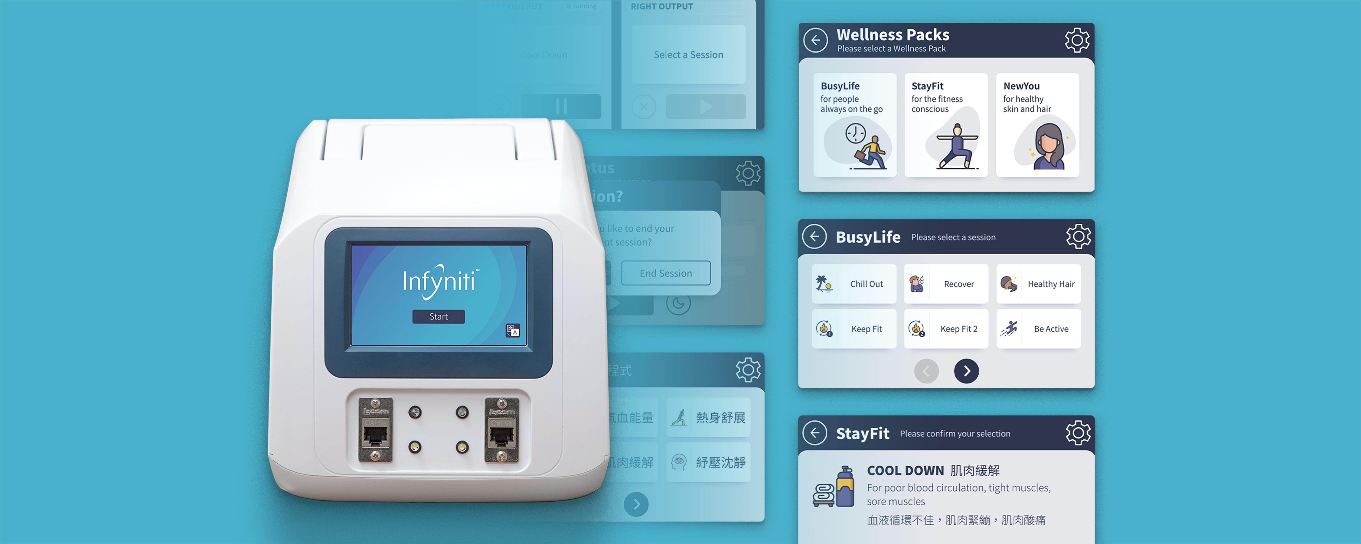
We merged multiple 20-minute Treatments into ailment-focused presets called “Sessions”.
The creation of Sessions:
Reduced the learning curve for new users.
Improved the efficiency and confidence of healthcare professionals and individual consumers in administering treatments.
Increased overall user satisfaction and adoption rates.
Navigating technical limitations
Designing the Infyniti required creative problem solving to work with memory limits.
Limitations of the device required a simple structure that could be applied to every model.
Navigation required easy access to therapy treatments so we grouped them into packs.
Limitations and market focus defined our Session Packs.
To validate the Session names I created a few spreadsheets and sent them to 12 participants.
8% of English terms were updated
24% of Chinese terms were updated
Part 1
For the first half, participants were asked to describe what they believed each Session achieved based on its name.
Example of the survey for the BusyLife category
The survey was also conducted in Chinese for the dual-language screens
Part 2
The second half revealed the intended purpose of each Session and asked the participant to react or brainstorm names.
Results
The feedback resulted in the change of several names, improving their clarity and differentiation. For example, the Session ‘Get Over It’ was renamed to ‘Recover’.
The team in Taiwan did the same with the Chinese naming.